While it’s easy to look back at the various decades that have passed now and point out the large trends that really defined them, people rarely take a step back and look at their home interior choices looking for similar patterns. Naturally, as you probably do yourself, we often just get on with things around the house, dismissing signs of the times like carpeted bathrooms, or cupboards built entirely around water heating units – If you’ve got either of those in your house, then you’ve probably got a new-build from the 90s too. While it’s easy to look back at the various decades that have passed now and point out the large trends that really defined them, people rarely take a step back and look at their home interior choices looking for similar patterns.
Minimalistic Decoration

I’m not sure about yourselves, but we’re based in the UK. That means that the average home is much smaller than that of our continental or American cousins. That said, there are definitely a few affordable tricks that you can use to make the space that you’re in feel bigger. For a start, you can brighten up your walls. A nice light-toned colour will make your room feel a lot more spacious, especially if you can get a lot of natural light into the room, due to the way that human eyes process light as an emptiness.
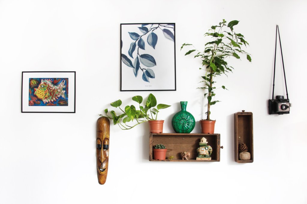
But, it’s not just that. You’ll need to make sure that those bright, clean walls are clear in order to maximize the illusion of spaciousness. This’ll mean that you’ll need to move your wall decoration around a little. Because, after all, if you cover a nice clear wall up with dozens upon dozens of photos, memorabilia, and decorations, then you’ll end up looking more like a diner than a spacious room. That’s not to say you can’t have your memories on the wall. Moving wall decorations into thematically related areas, bunched up, is a much better way of using the space. If you have a desk or computer in the room, then put the notepad and computer-related memorabilia near it. If you have a mantlepiece or antique fireplaces, then why not mount the family photos around that instead? If there’s one wall to keep clear and light on items, it’s either the longest wall or the best-lit one.
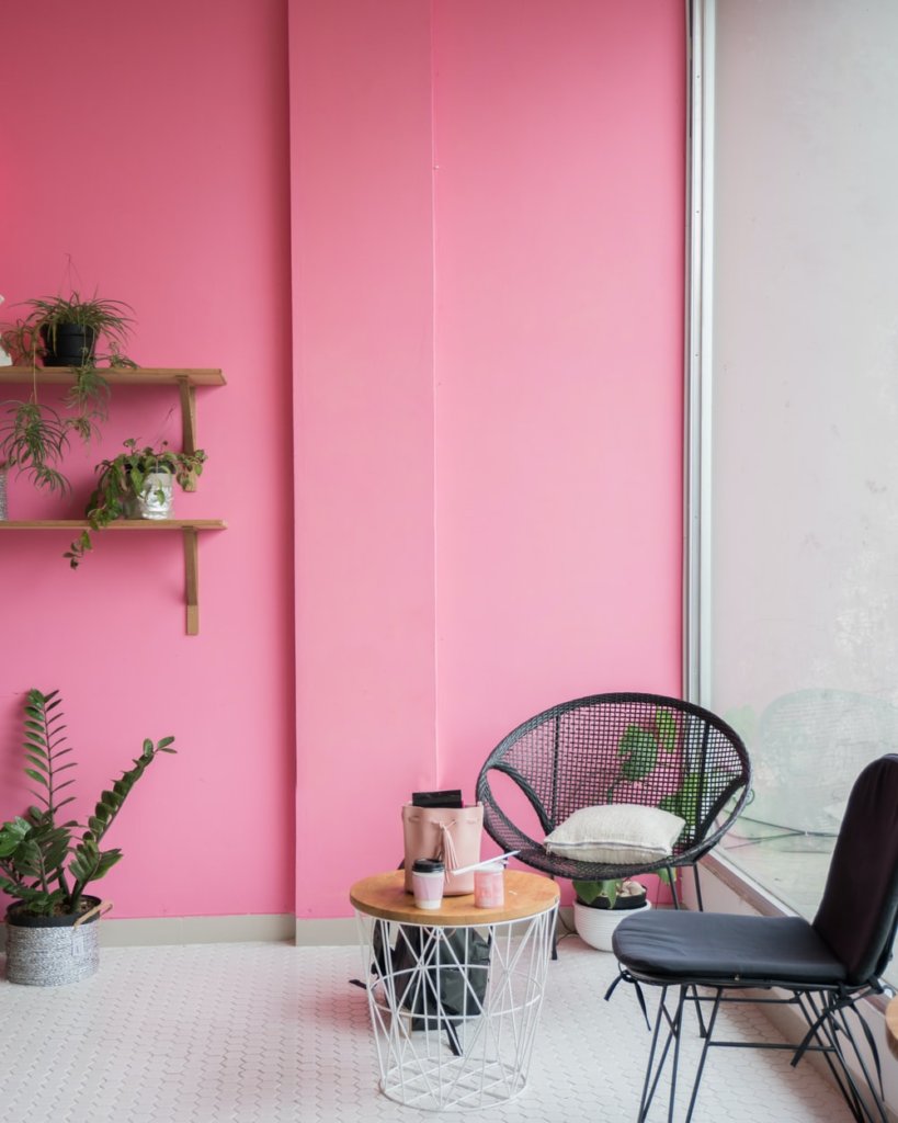
Bright colours to contrast space-widening walls.

But, if your walls are completely bare then it can lack character. This is where furniture, like bookcases, cabinets or your chairs, can be used to accent the white-space. Bright colours, like Navy Blue, Olive Green, Firetruck Red or even pinks and purples, can really pop when put into a clean, white space. And furniture that is visible and has a clear function is clearly the best type of design compliments.
Wood Floors

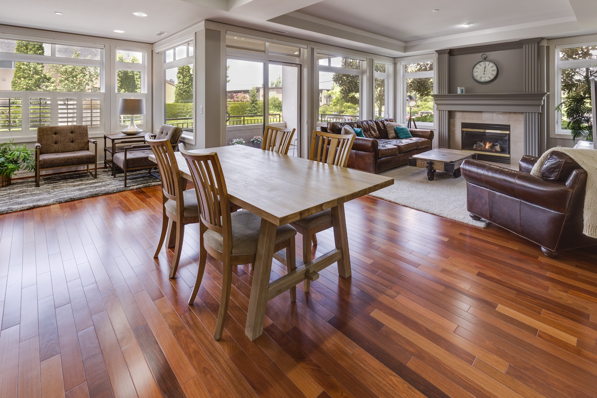
If you’re laying out your room to focus on the natural light that comes into it then you will want to use similar practices when it comes to your flooring. You can get laminate flooring in a variety of colours, but you can get brushed & lacquered flooring for relatively cheap these days too. Whatever you go for though, the important thing is being consistent and building around that clear effect. Laminate is perfect for this, but ultimately, the best advice that I can give is that you should avoid multicoloured or heavily layered carpets. If you’d like an accent piece, or a splash of colour on the floor, then you can pick up a nice bright rug to pair with furniture or warm up a clear space of flooring.
Renewable Energy Solutions
Incorporating renewable energy into your home modernizes it and makes it more eco-friendly and cost-efficient in the long run. One popular and effective way to achieve this is by installing home solar power systems. These systems harness the sun’s energy to power your home, significantly reducing your reliance on traditional energy sources and lowering your utility bills. With technological advancements, modern solar panels are sleek, efficient, and can be integrated seamlessly into your home’s design, ensuring you can enjoy aesthetic appeal and sustainable living.
Flowers and Plants

One thing that is incredibly in vogue at the moment, aside from the above minimalist trend, is a return to the flower and plant-heavy focus of many years past. Houseplants, even artificial ones, really liven up the space – and as I previously mentioned the emulation of wide-space through the clear, bright walls is perfectly complimented by natural life. It’s not just house plants themselves though, wall decorations which depict or resemble flowers really help to build on that feeling of being outside and within nature, and really pop when the sun is shining brightly through your windows.
What are your tips for modernising homes?


I love wooden floors and minimal designs. I’ve always loved white walls with pops of colour to add character to the rooms but I’ve seen some gorgeous before and afters with brighter colours lately x
Sophie
There have been so many people talking about brighter colors!