
Paint by numbers offers a simple way to enjoy art, but color choices can make the difference between a flat picture and one that feels balanced and natural. Many adults enjoy the process but want their finished work to look more polished and cohesive. Learning how to coordinate colors with more intention helps each painting look smoother and more visually pleasing.
This article shares practical methods that focus on how to build a base, organize colors, and apply paint in a way that supports harmony. By paying attention to how shades interact, anyone can move beyond just filling in spaces and start creating pieces that feel more complete.
- Start with lighter colors to establish a base before adding darker shades for depth
Many artists find it easier to begin with lighter shades. This approach creates a clean base layer and makes it simpler to cover small mistakes later with darker tones. It also helps the final image look more balanced and natural.
By starting light, painters can map out the main areas of the design without overwhelming detail. Darker colors then build depth and contrast, which adds definition to shadows and background elements. This step-by-step method keeps the process more organized.
This approach also supports relaxation. Working from light to dark allows painters to progress gradually, which can be calming. Many people use this technique as part of stress relief with adult paint by number, since the slower pace encourages focus and reduces tension.
In addition, lighter tones help highlight areas that should stand out. Once the base is set, darker shades bring dimension, making the final picture feel more complete and visually clear.
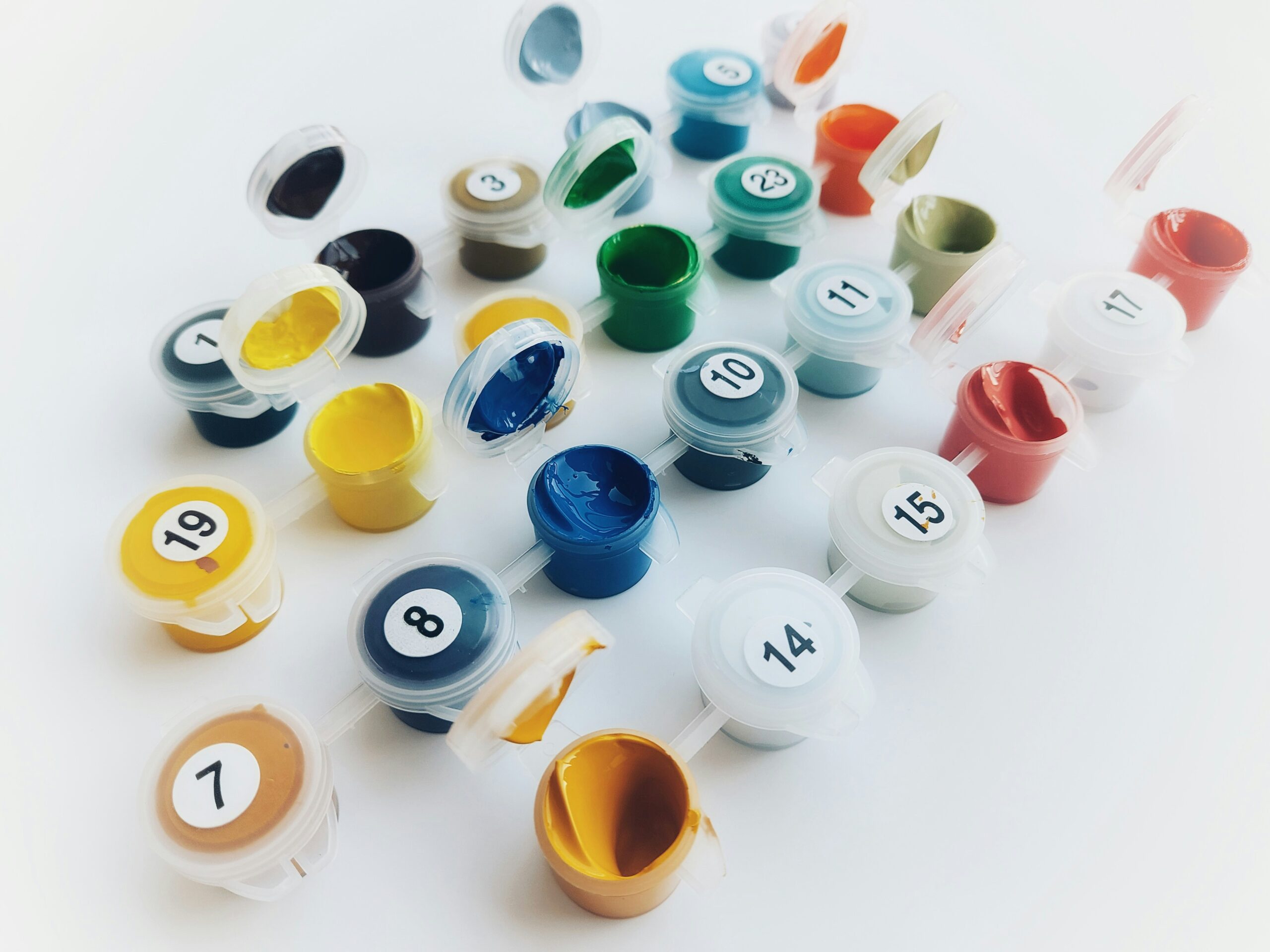
- Use a limited palette to maintain harmony across your painting
A limited palette helps colors feel connected and balanced. By choosing fewer paints, the artist reduces the chance of clashing tones and creates a more unified look across the canvas. This approach works well in paint by numbers, where harmony matters as much as accuracy.
Artists often select three to six colors that share similar undertones. These shades can mix into a wide range of hues, yet they still feel related. As a result, the painting develops a consistent mood without overwhelming the eye.
Mixing from a smaller set of paints also teaches how colors interact. For example, blending red, blue, and yellow can produce natural greens, purples, and oranges that already complement one another. This method keeps the painting cohesive without requiring dozens of separate paints.
Therefore, using a limited palette not only simplifies the process but also gives the final piece a balanced and polished appearance. It allows every part of the artwork to connect visually while still offering variety.
- Blend adjacent colors gently to create smooth transitions and avoid harsh lines
Artists often notice that paint by numbers sections can look blocky if colors meet with sharp edges. To soften this effect, they can blend shades that sit next to each other on the color wheel. This approach creates a more natural flow between tones.
A small brush works best for this task. By applying light strokes at the border of two colors, the artist can merge them gradually. This reduces the appearance of hard lines and gives the painting a smoother finish.
Low opacity or diluted paint can also help. Thinner layers allow one shade to overlap another without covering it completely. As a result, the transition looks subtle rather than abrupt.
Artists may also build layers slowly to achieve depth. Allowing one shade to dry slightly before adding the next prevents muddy results. With patience, the final image looks more cohesive and polished.
- Organize your paints by color temperature to easily identify warm and cool tones
Separating paints by temperature helps artists see patterns more clearly. Warm tones include reds, oranges, and yellows, while cool tones include blues, greens, and purples. This simple division makes it easier to choose colors that work together.
By grouping paints in this way, artists can quickly adjust the mood of a painting. Warm tones often create energy and brightness, while cool tones suggest calm or distance. Keeping them organized allows faster decisions during the painting process.
It also prevents confusion with similar shades. For example, a warm yellow and a cool yellow may look alike in the tube but behave differently on the canvas. Laying them out by temperature avoids mistakes and saves time.
Artists who practice this method often find smoother blends. It becomes easier to balance contrast, avoid muddy mixes, and create harmony. A clear palette layout supports better control and more consistent results.
- Apply thin layers of paint to control color intensity and prevent muddiness
Applying paint in thin layers helps keep each color clear and defined. Thick coats often mix together on the surface, which can create dull or muddy results. By building layers slowly, the painter gains more control over how strong or soft each shade appears.
Thin layers also dry faster, which makes it easier to add new colors without unwanted blending. This approach allows each section of the painting to stay neat and accurate, especially in detailed areas of a paint by numbers kit.
In addition, layering thin coats gives the artist a chance to adjust the intensity of the color. For example, a light wash can create a softer look, while extra layers can deepen the tone without losing clarity.
This method works well for both light and dark colors. It prevents the paint from overwhelming the numbered outlines and helps the finished piece look more balanced and polished.
Conclusion
They can improve color coordination in paint by numbers by practicing simple habits such as planning color order, paying attention to contrast, and keeping brushes clean. Small steps like these help the final piece look more balanced and polished.
It also helps to slow down and study how colors interact on the canvas. By noticing edges, shadows, and highlights, they gain better control over the outcome.
As a result, each project becomes not only more enjoyable but also a chance to build stronger artistic skills over time.