We’ve previously written about how you can reinvent a small space, for instance, making the corner of a small room into a functional office space, and so I want to spend a little bit of time talking about some of my previous experience doing merchandising and layout work in retail and non-retail spaces, and about how lessons from that can help you further optimise a space.
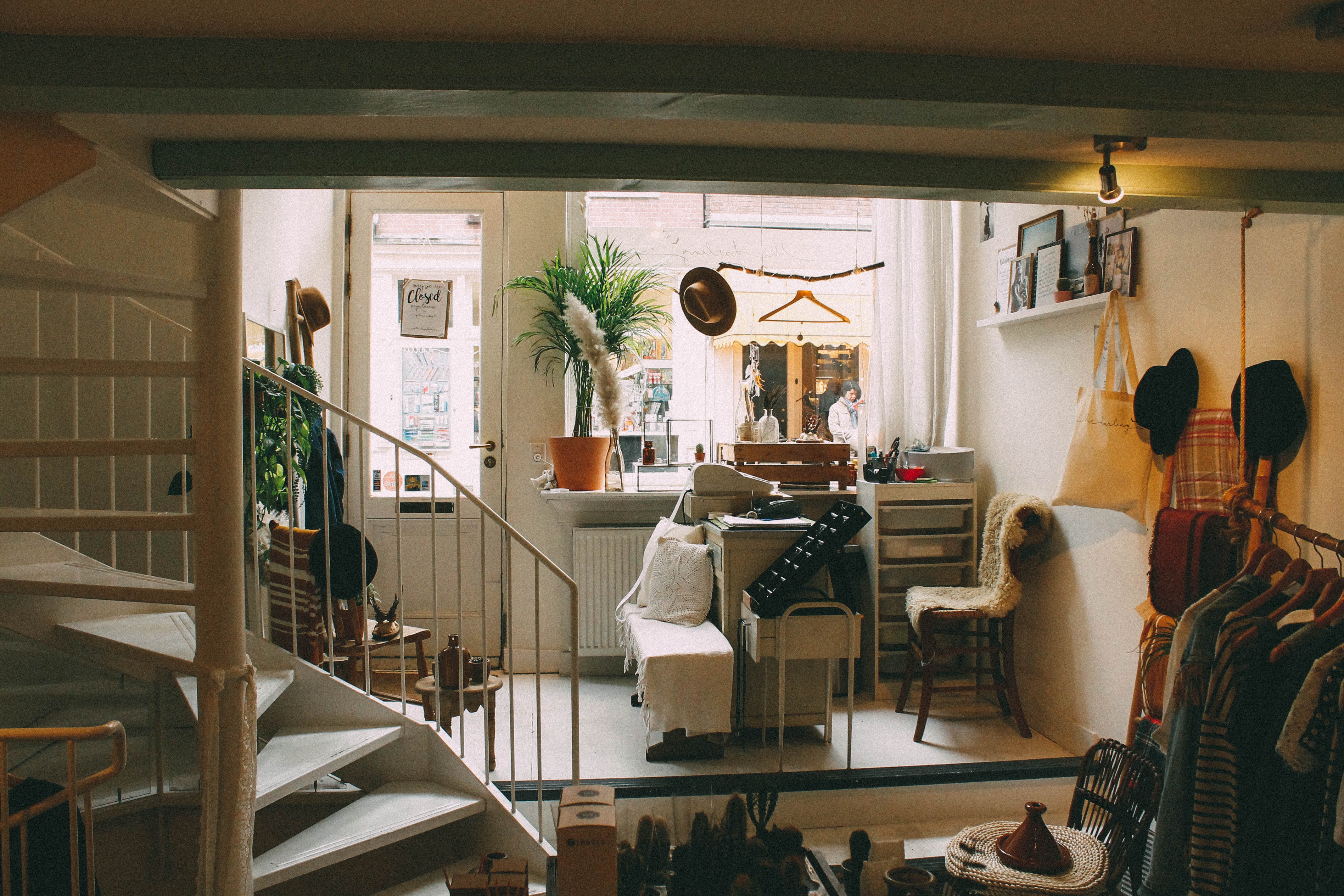
Shops, and retail spaces, are one of those things that a lot of thought goes into, but that we don’t really think about. Shops normally change layout multiple times a year, with lots of considerations going into a lot more factors than most people consider. For instance, with one shop I worked at, clients would actually bid to be on the left-hand side of the store because, in the UK, people read from left to right. It was a tiny, subtle thing that was worth a lot of money, and they knew that if people ‘read’ the store, they’d see their brand first.
With that said, you’re certainly not trying to sell your space at home. But there are more than a few tips you can take from the pros of retail store design that’ll make it easier on the eyes and better to look at. Let’s look at a few easy ones now.

Give Everything a Home
This is such a simple sounding one, but incredibly important. Whenever I get back from an event there’s always a day or so where I have little piles of things on my desk. During busier periods they really start stacking up and my desk starts to get cluttered. It’s incredibly easy to create a ‘to-do’ pile, but when you start losing clear surface area you start losing efficiency working in the space. You’d never walk into a shop and find piles of stuff dumped on the floor away from where it should be, in fact, the floor is normally not used for merchandising goods because ‘eye height is buy height’ and nobody really crawls along the floor in a shop experience. Instead, keep the floor as clear and as clean as possible to give your room the feeling of space. Perhaps give your floor a make over with some new carpet, or hard wood flooring. Even some new MDF skirting boards can give your space a cleaner look and feel.
It might not seem intuitive, but give everything a home, even if that means merging up those little piles you have into a to-do list, the last thing you want to do is surrender space to things you’ll get to later. On the subject of that…

Storage is king
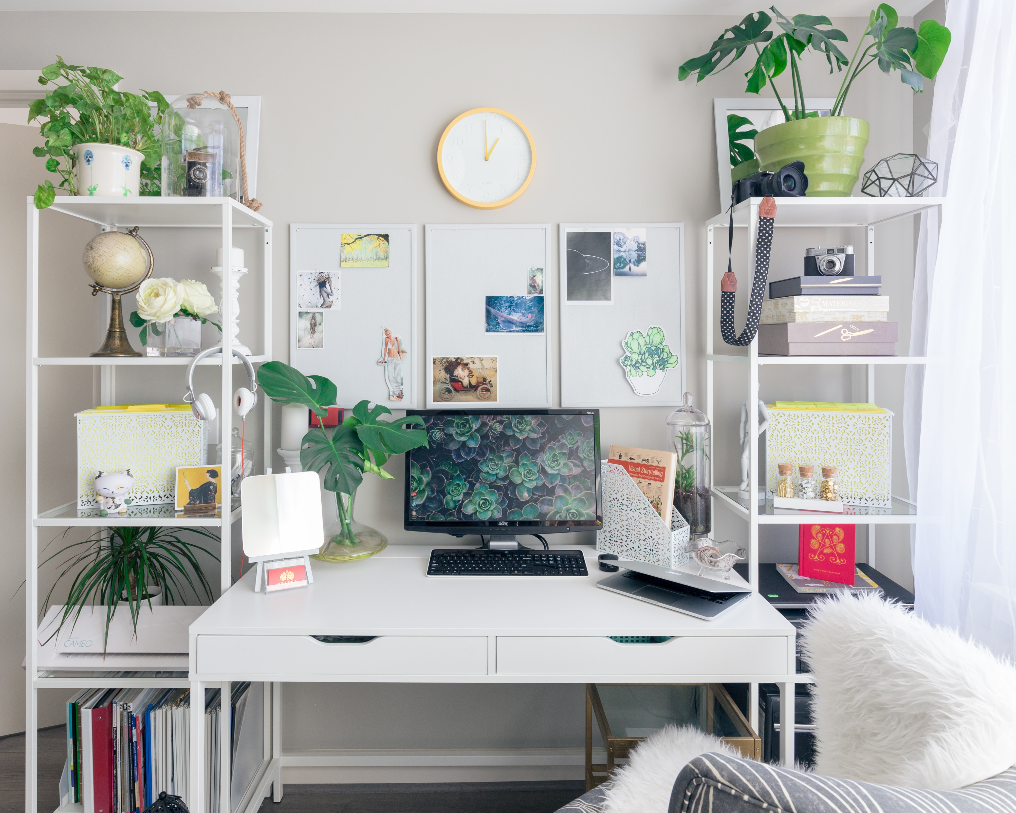
When you go into a shop its incredibly uncommon to see any of the work in progress areas. That isn’t to say that you should exercise a zero tolerance policy to having things out that are being worked on, just that you should keep those work in progress places to a minimum. Anything that you’re done with; books you’re reading, art you’ve framed, business cards you’re done with, should not only (as above) have a home, but should be there for the majority of the time. Of course, needing places that can be homes for things are important too. I prefer open shelves (you can visibly partition them by having spine-out books/games, an item, and then the next collection of things) or shallow-drawer cupboards which give lots of smaller homes for items rather than big-deep pits where lots of stuff can end up jumbled together.
When merchandising a store, or cooking a meal, having specific homes for things, in specific places, makes things easier to find and also easier to keep check of. I know that if I need some selotape I can go in the drawer, three-down, on my right and we’re there. It’s simply a case of efficient storage, efficient time management.
Group and theme
On the subject of efficient storage is something that most people start doing by habit anyway. When you go into a shop and want a book, you go the book section. In the library you go to the genre section that you want to browse. At home you should have similar systems in place too. Need a book on game design? Need it regularly? Maybe you should considering sorting your resource books by resource rather than by title or author in which case. Stuff like this not only saves you time while working and living in your home, but also makes much more sense and creates themed areas.
Themed areas are really important, and allow you to add a little bit more character to your home – as well as give you the opportunity to slot some of your one-off items into your home design. We see the nearest equivalent in deal sections, or aisle-ends in store: Easter Break? Outdoorwear, water bottles and Easter Eggs are all pulled from their own sections into a new themed area where each thing has a new connecting element. The home equivalent of this might be taking your Tabletop RPGs away from your other books, giving them a dedicated area and adding some of your minitures and dice around them. Suddenly you’ve got a themed, logical and visually appealing area that serves as a great reminder of your hobby. It’s not hard to forget that all of your RPG stuff is in one place, and all of your Mario stuff is in another, because those set zones are logical and easy to remember.

Deploy the colour palette
There’s a chance that you’ve stuck with me thus far, but you’re sitting there thinking “this is great Mr ‘space-on-the-walls-for-shelves’ but, what about me?” If you’re really that short on space then you’ve probably already shrunk down the amount of stuff you own far more than you’d like. In that case, it’s simply about optimisation: getting those storage options in and starting to play with colours to make the space larger.
Colour, or the absence of it, is one of the greatest tools at a store’s disposal, but normally because they already have a lot of space. You’ll rarely find store’s that clutter up their eating or browsing space with lots of objects, and similarly, you’ll rarely find a place that throws dozens of colours into smaller spaces. That’s because colours are, to the eye, similar to objects, and if you load a place up with them then it looks like a cluttered mess.
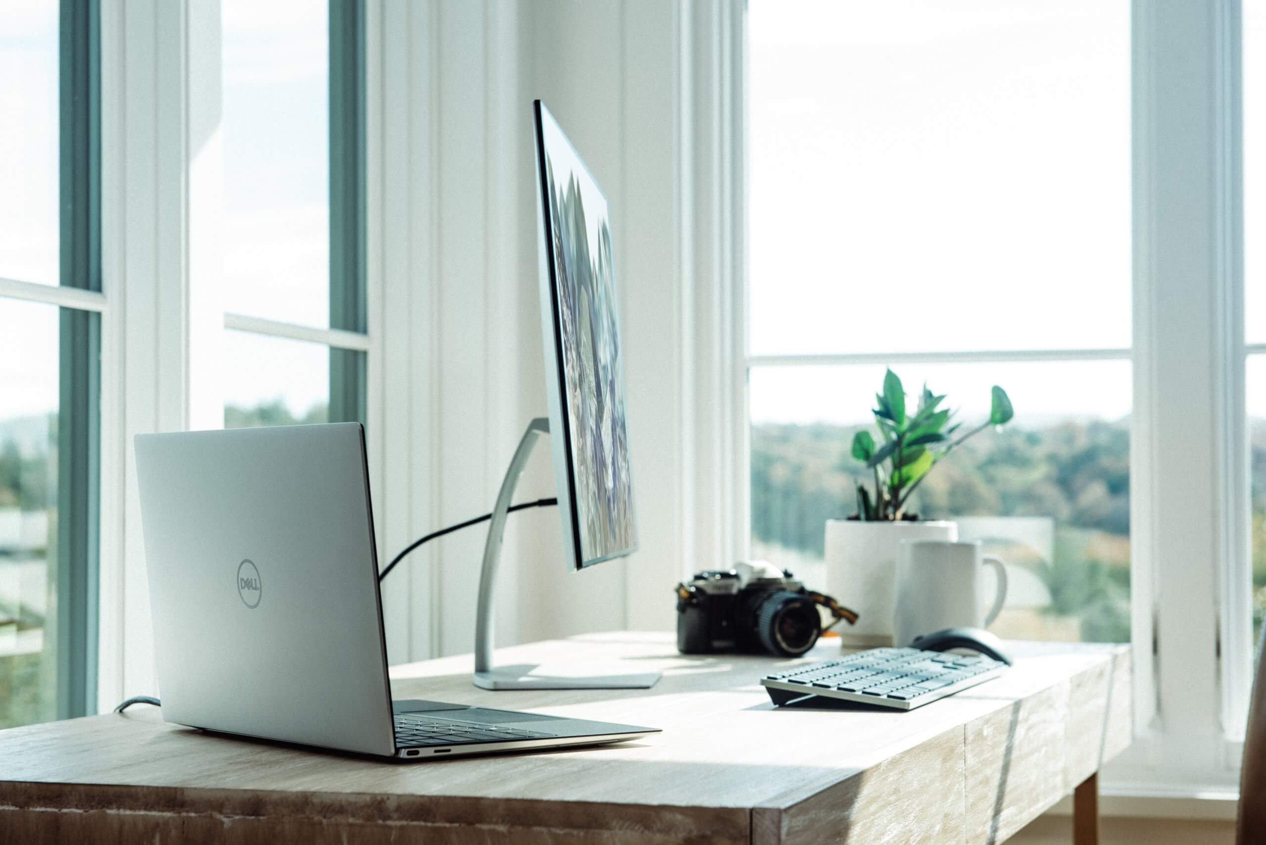
The cure for this is to swap out some of your existing deeper, or varied, colours for more neutral ones. Got a bright red or dark black desk? Swap it out for lighter or more natural tones like light wood colours or white. Similarly, anything that you do have on your wallspace should be raised higher to give you some clear space behind your furniture or screens. Even 6-10 inches of clear space behind a screen can brighten up and clear up your space, especially if you have a bright, clear wall colour.


I would love to do this. Our downstairs area is all open plan, so living, dining and kitchen but we also sleep on the sofa bed and the table doubles as my office space.
We have Dann’s office in the livingroom too.
I really love what you did to the space, everything seems very relaxing and in order so to speak, amazing tips!
We love having relaxing spaces!
I just think I have so much stuff that I struggle to make things look minimal or anything like that. Although storage is always my friend x
Storage is a must in every space.
Thanks for the tips! I am planning to re-decorate my small office space and this gives me some ideas. I learn so much from your blog post. Thank you!
I hope this really helps!
We’re a little short on space and at first it was hard to condense. Now it’s made me more simplistic and I don’t mind decluttering. I do like to use color to make what we have pop.
It’s so good to use color in that way.
I really need to improve my storage at home! My house is very cluttered at the moment so could do with a spring clean and some minimal inspiration
Laura x
Now is the time!