
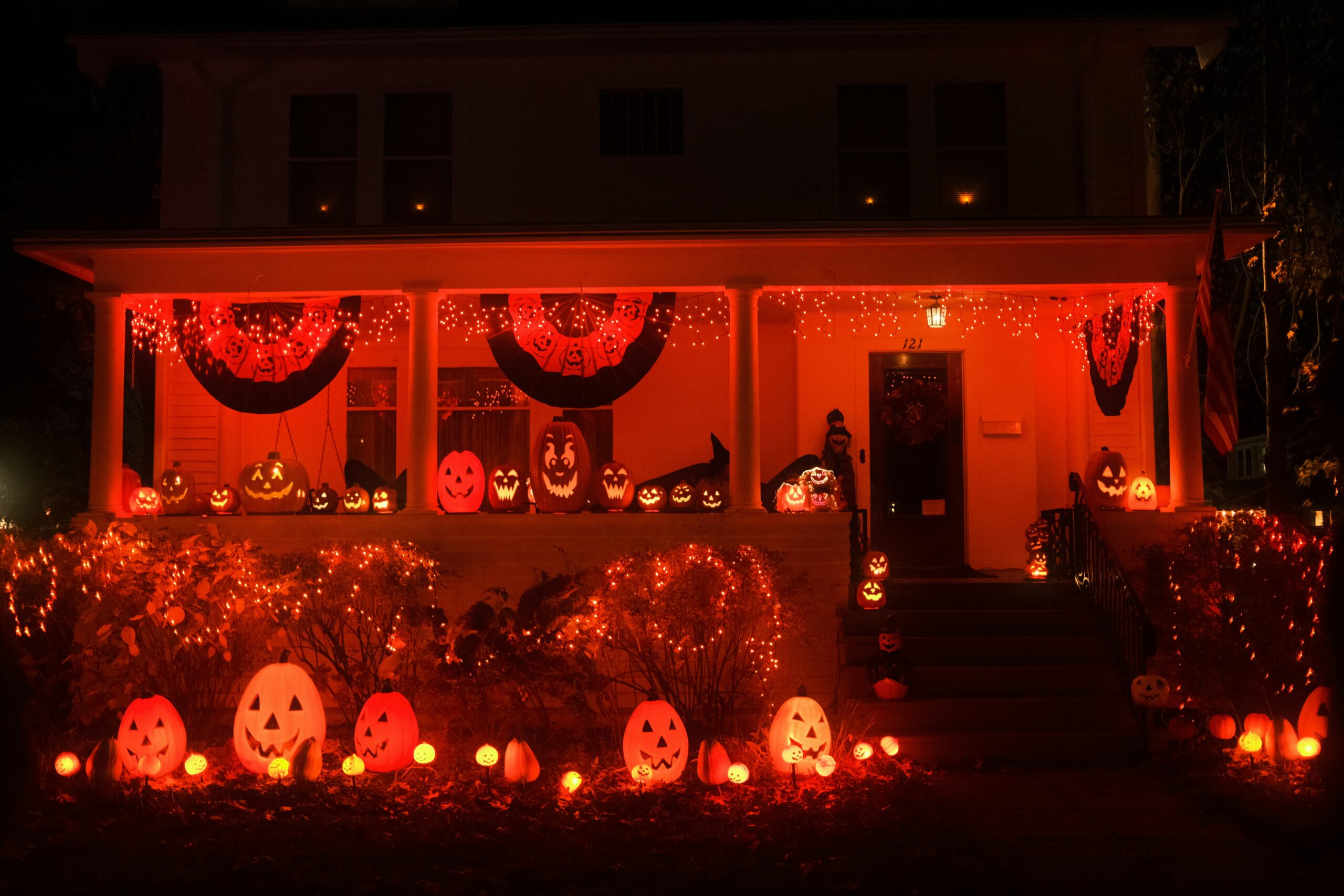
Halloween has become one of the biggest excuses in the calendar for homeowners to go a little overboard with outdoor lighting, and LEDs have made that easier than ever. Coloured bulbs that once meant fiddly, heat-prone party lights now come in low energy, long lasting options that can transform a front garden in an afternoon. Brands like Philips lighting have helped push this shift, offering coloured LED ranges that are far more reliable and weatherproof than the novelty string lights of years past. The trickier question isn’t whether to use coloured LEDs, but which colours actually create the effect you’re after, and why some combinations work far better than others.
Why Colour Choice Matters More Than People Think
It’s tempting to grab whatever multipack of Halloween lights is on the shelf and assume the effect will look the same regardless of colour. In practice, colour has a huge impact on how a display reads from the street. Some shades create genuine unease after dark, while others end up looking more festive than frightening, which isn’t always the intended result.
Understanding what each colour communicates, and how it interacts with your house’s existing exterior lighting, makes the difference between a display that looks intentional and one that looks like a few random bulbs were swapped in without much thought.
Orange: The Classic Choice for a Reason
Orange remains the go-to Halloween colour, and there’s a good reason it hasn’t gone out of fashion. It’s strongly associated with pumpkins, autumn leaves and bonfires, giving it an immediate seasonal association that other colours simply don’t carry in the same way. Orange LEDs work particularly well around doorways, porches and pumpkin displays, where a warmer glow feels welcoming to trick-or-treaters rather than unsettling.
The downside of orange is that it can read as more autumnal than spooky if used across an entire house. For homeowners wanting a display that feels cosy and seasonal rather than eerie, orange on its own does the job well. For something with a bit more edge, it tends to work best paired with a second, cooler colour elsewhere in the display.
Purple: Adding an Eerie, Atmospheric Edge
Purple has become increasingly popular for Halloween lighting, largely because it creates an atmosphere that orange alone can’t manage. Used around windows, under eaves or uplighting trees and bushes, purple LEDs give a property a genuinely eerie, otherworldly quality after dark, especially when the light catches fog, cobwebs or other decorations.
Purple tends to work best as an accent rather than the dominant colour across a whole house. Overusing it can tip a display from spooky into something closer to a nightclub, particularly on smaller properties where the light bounces around a more confined space. A little goes a long way, and it pairs particularly well with orange for a display that balances warmth with genuine unease.
Green: Best Used Sparingly
Green is the colour most associated with classic horror, from glowing potions to eerie mist, but it’s also the one that’s easiest to overdo. Bright green LEDs across an entire frontage can start to look more like a science experiment than a haunted house, particularly under clear skies where the colour doesn’t diffuse as effectively as orange or purple.
Used sparingly, though, green can be highly effective. Uplighting a single tree, lining a path, or adding a subtle glow near ground level creates a genuinely creepy effect without overwhelming the rest of the display. It’s generally best treated as a supporting colour rather than the main event.
Combining Colours Without It Looking Chaotic
The biggest mistake homeowners make with Halloween lighting isn’t choosing the wrong colour, it’s using too many colours without any real plan. A frontage covered in clashing orange, green and purple bulbs with no structure often ends up looking messy rather than atmospheric, especially once neighbours’ displays are visible in the same street.
A more effective approach is to assign each colour a specific job. Orange might handle the doorway and pumpkins, purple could take care of window and eave lighting, and green might be reserved for uplighting a single feature like a tree or bush. Giving each colour a clear role, rather than scattering them randomly, creates a display that looks considered rather than accidental.
Getting the Balance Right for Your Property
The right combination ultimately depends on the size and style of the house, as well as how much of the display is visible after dark. Smaller properties generally benefit from restraint, with one dominant colour and a second used sparingly as an accent. Larger properties with more exterior space to work with can handle a broader mix, provided each colour still has a defined purpose rather than competing for attention.
Whatever combination is chosen, the aim is a display that feels intentional rather than thrown together at the last minute. With LED lighting now widely available in a huge range of colours and brightness levels, getting Halloween lighting right is less about buying more bulbs and more about being thoughtful with the ones you choose.